
I've always been happy (even though I wasn't very good at dancing...) to have been a part of the dance community at UCSD.
So naturally, partnering with my school's K-Pop dance org to make mockups for their first website was exciting, especially since it was my first project in a web design type of setting.
Roles: Researcher, visual designer
Skills: Needfinding, user interviews, storyboarding, wireframing, rapid prototyping, visual design
Deliverables: Client survey, personas, creative brief, wireframes, prototype
Date: Jan - Mar 2019 (10 weeks)
Teammates: Alexandra Wei, April Gau, Jason Liu
The Client
See full client survey here!The first thing we wanted to do was to interview our client to get a better understanding of the types of members were involved in the organization. Since KOTX hasn't had its own website before, we also wanted to learn about its purpose and what was important to the org's board and its members. This would inform any features and architecture of the site, alongside the branding.
We learned from talking with our clients that:
- the org prides itself on its whimsy and welcoming nature that it feels it gives off
- they wanted dark background colors with bright accent colors
- they believed users could be divided into prospective members, new members, current members, and persons looking to collaborate with/book KOTX for entertainment
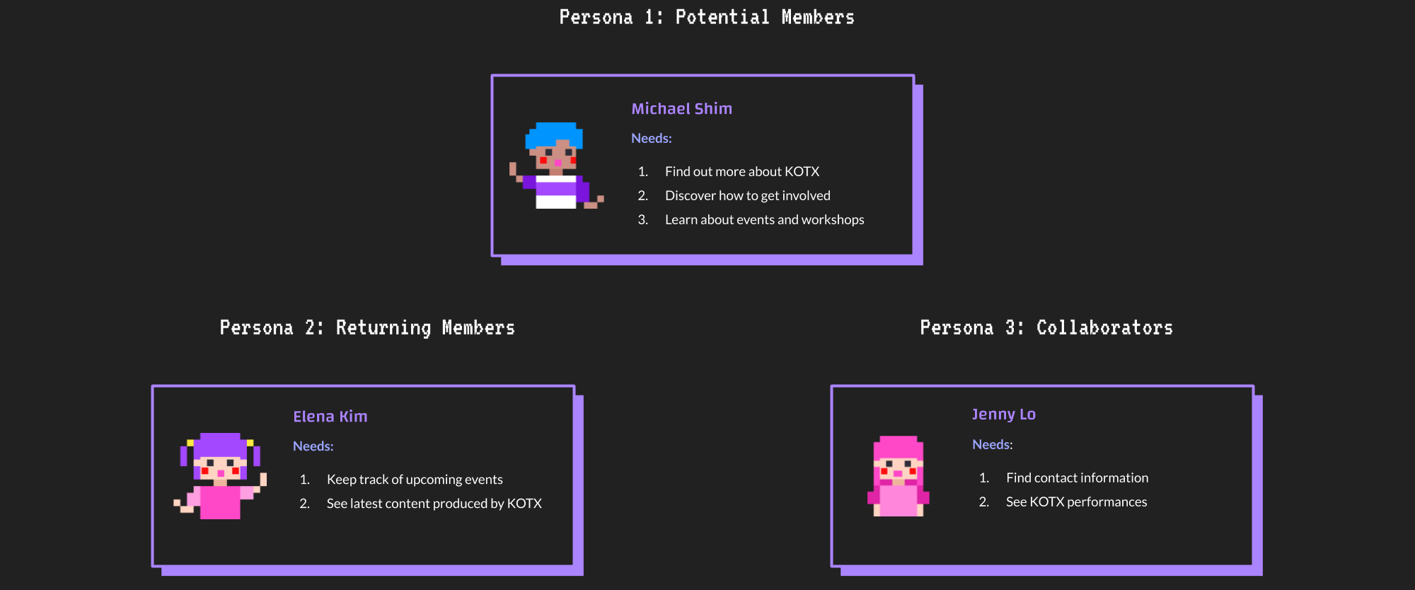
User interviews + Personas
See all personas, use cases, and interview data here!We used the member types from the client interview to inform who we'd reach out to for our user interviews. In them, we asked them further questions about, from their point of view, what KOTX was to them, what a typical day with KOTX would be like, and any issues logistically that they felt could be improved within the org.
Throughout our interviews, we learned:
- new and prospective members have very similar use cases and should thus be grouped together
- Facebook events and groups were the main use cases in which members had issues (Specifically, sometimes posts would get occluded by other comments/posts and people would be left unaware of event logistics.)
- more understanding of the organization's fun-loving personality and branding
We consolidated these findings into personas with specific scenarios and corresponding use cases to help us prioritize features on the prospective site.
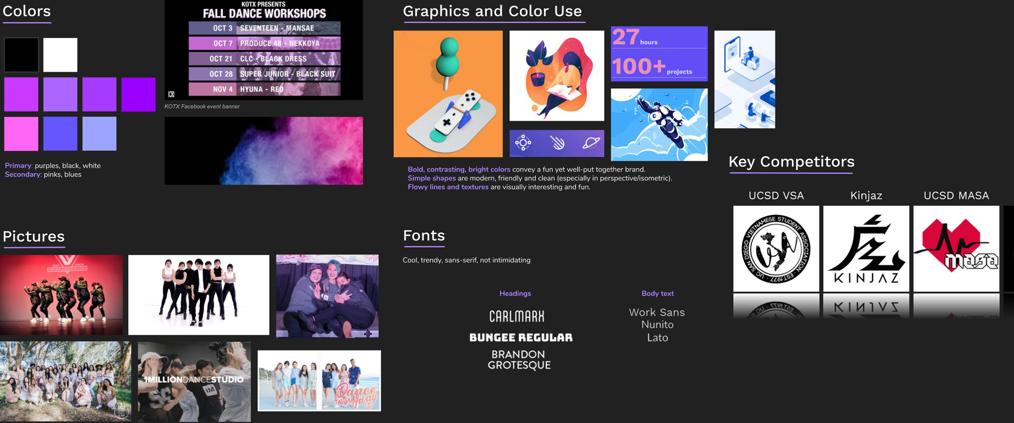
Competitive analysis + Mood boards
See competitive analysis and mood boards here!Our next steps involved finding inspiration for branding based on our client and users interviews. While taking into account our users' desire for a mixture of dark backdrop and bright accent colors, we looked at websites for college organizations, professional dance studios and dance groups.
Discussions I had with my team involved:
- We liked the pleasant and simple navigation of college orgs' websites, but didn't want to look like them entirely as we felt college org's professional and sterile branding contrasted with KOTX's personality.
- Finding out how to incorporate bright and dark colors. Sites for dance studios used black and dark colors to emulate a dance studio or theater where lights are dimmed.
- We liked how personalized bios with lighthearted graphics and copy made people and branding on websites feel approachable.
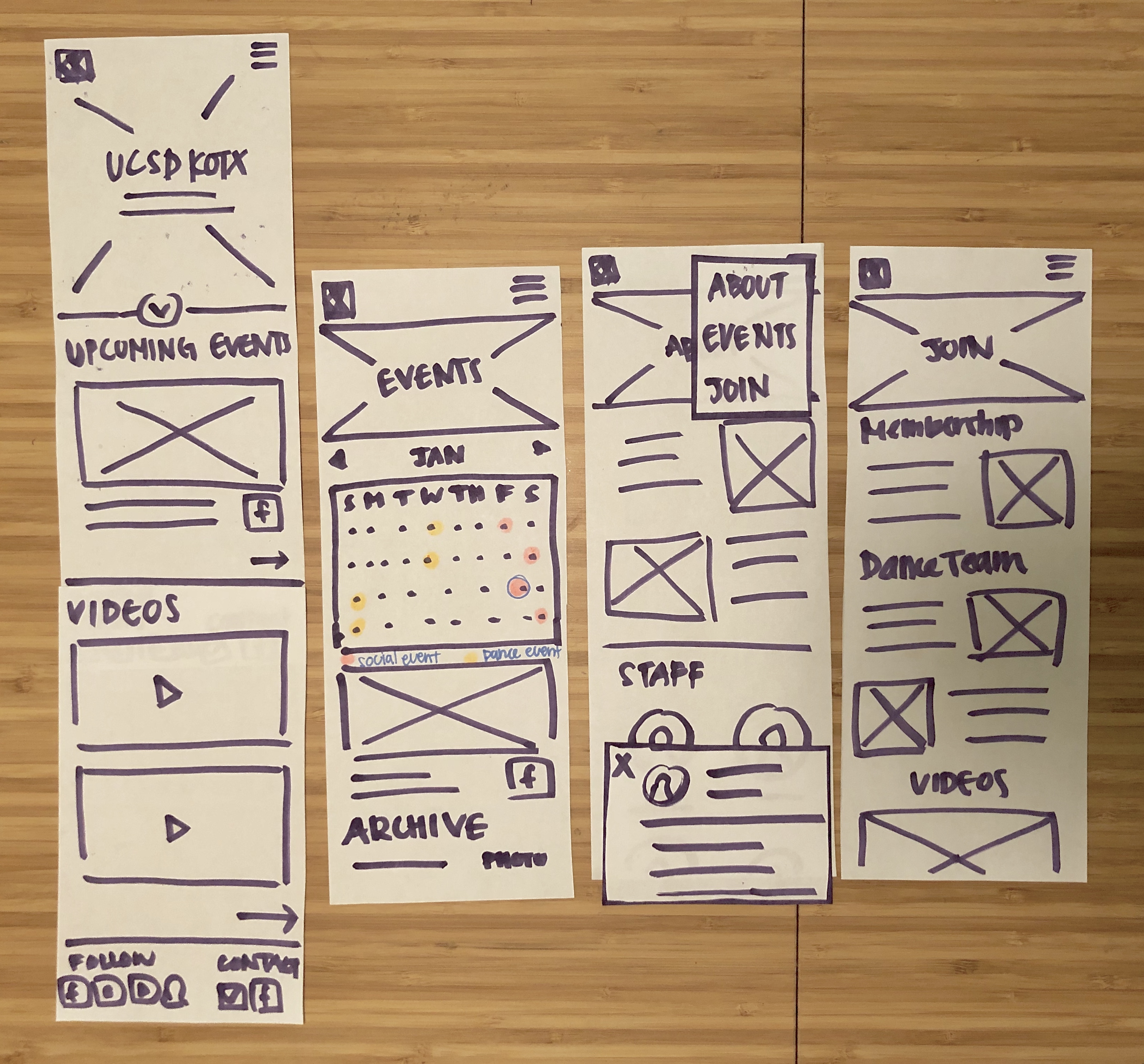
Sketches + Creative brief
See the creative brief here!We presented our design plans in a creative brief that we presented to our client to get feedback and approval. In it, we detailed 4 HTML pages we planned to implement, our intended audience informed by our personas, and sketches to the potential design.
Hi-fi wireframes + Functional specification
In another meeting, we detailed the features that we planned to implement through the annotated screenshots in our functional specification.
Prototypes + Card sort + Styling + trying to balance it all
See card sorting data here!Styling challenges:
After finishing up most of the content in our wireframes, our stakeholders gave us varying opinions on styling:
- dark scheme with purple
- bold scheme with streaks of color
- gifs/graphics that show fun side of KOTX
Taking these sentiments into account while trying to capture the true essence of KOTX was important to us since the group emphasized the personality the group had. When asked how they would describe themselves, a stakeholder said they were "lively, meme-y, inclusive and fun!"
To address this, my team and I made our own individual style tiles (I made style tile 4!! hehe) based on our impressions of the group from interview data and iterated upon them after some collaborative discussion. The end results were 6 style tiles sent to members and our clients in a Google Form which we had them vote on which they felt represented the group's preferences best and give us feedback.
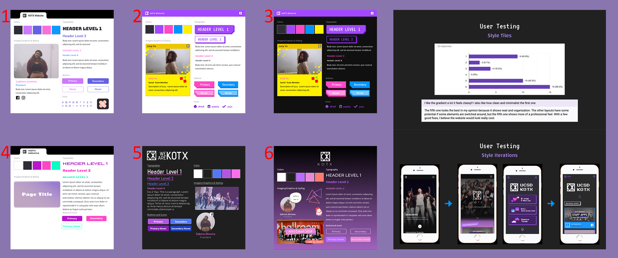
User testing and Information architecture challenges
We had 3 end users run through our website and the feedback we received involved:
- differences between getting involved and actually joining the org wasn't exactly clear
- gallery was hard to find due to it being under the Events page as "Archive"
Our clients also gave us suggestions such as:
- more gallery visibility
- more of an emphasis on contacting KOTX
- new page suggestions: FAQ and dance policies
These are the things we decided to do to address the feedback we got:
- changed the Archive to Gallery and increased visibility (font and album preview size)
- made a contact page with people trying to formally reach out to KOTX; kept footer containing socials for more immediate contact, with new/prospective members trying to figure out event details in mind
- kept Staff under About page because of web page conventions, hoping access to contacts through contact page/footer to offset any confusion
- removed the videos under the Join page
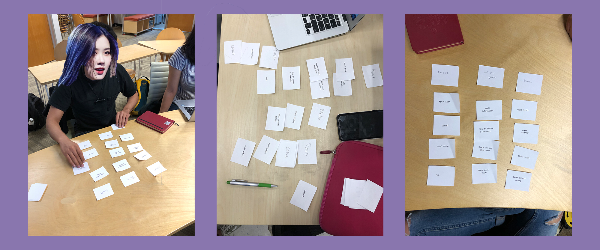
Card sorting to finalize information architecture
In order to further validate our nav changes, we spent a week doing card sorts on 10 people and tallied the data in a spreadsheet to see which layouts seemed most commonly sorted.
Understanding the mental model of membership
I remember it was during one of our weekly meetings and we happened to start discussing membership in KOTX. As we talked more about it, I realized each of my teammates' understanding of a member versus a non-member was slightly different, some saying non-members couldn't dance at all and another saying they couldn't go to socials.
I pointed this difference in our respective mental models and we planned a (panic!!) interview with a board member who could speak on the specifics of membership.
We learned that non-members could actually attend socials and dance at workshops, but they could not be in any videos, be a part of the Big/Little program, and were exempt from other discounts/benefits. We, thus, made graphics and added this content to the Join page.
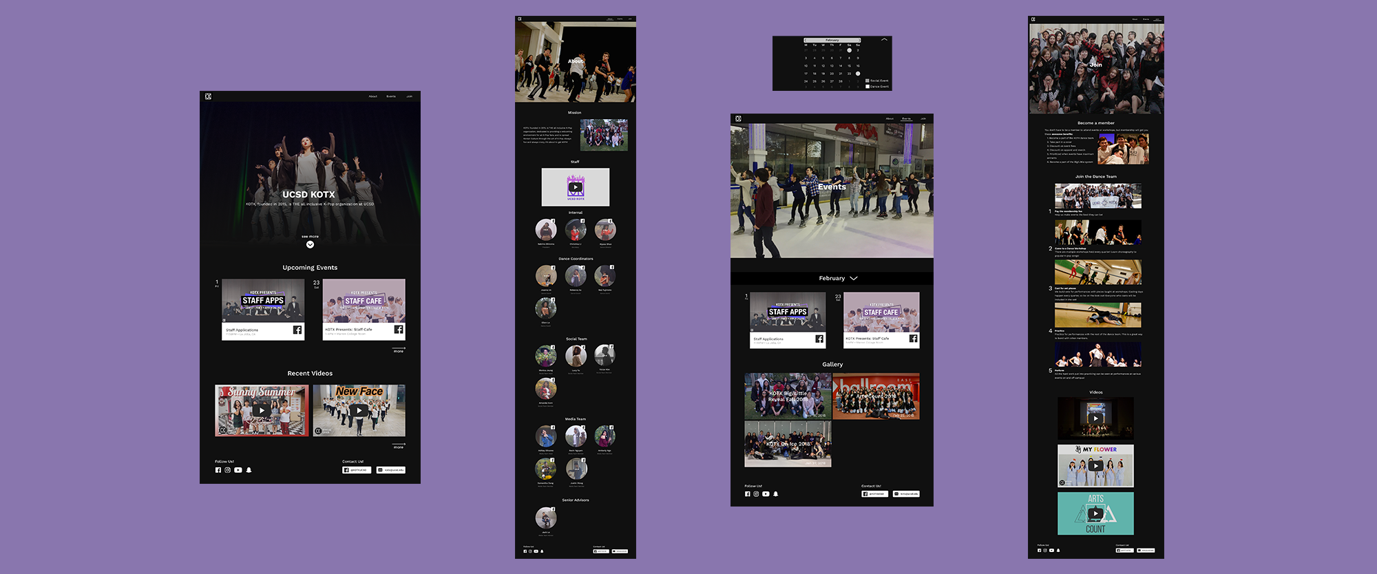
Final prototype
After implementing these changes and doing some more user testing, we received positive feedback.
View the final desktop prototype and mobile prototype here!